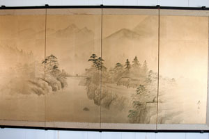
SW sent me a photo of a Japanese screen, four-panels, 15 inches by four feet high. The screen consists of a patched together series of four inch golden paper squares drawn on with ink. SW purchased it in the 1960’s from a family from Japan. Screens are difficult to evaluate from photographs, but SW writes some things that make this appraiser believe SW has “the real deal.”
The Japanese screen, composed of a series of papers, perhaps once part of a screen, and the papers look ink washed. Also SW reports the screen bears a “chop mark,” a square in which lies the artist’s signature. The chop mark is sometimes an indication of a 20th century (not old) screen, as earlier Asian works were not often signed. So we have mixed message, here; let’s do some research.
I assume this 19th century Japanese screen came out of the Kano School. Ink wash on gold leaf papers, a depiction of a house on a river, in the mountains, with a lone figure crossing the bridge gives it away.
Let me describe what “Kano School” means:
First, the Kano School represents one of the longest lasting styles of painting in the world. Second, one family, the Kano family, promulgated this style. The linear style portrays mainly landscapes, sometimes framing (important for the early Japanese culture) symbolic animals. Sometimes symbolic in a politically subversive way, although guardedly.
The most difficult aspect of the Asian aesthetic, for Western-trained eyes to see, is the spirit/soul of the drawing. Because the goal of Kano School ink wash drawings is not a realistic portrayal of a landscape, but a capturing of the essence and spirit of a place. So if a Kano School painter wishes to paint a mountain landscape, the viewer may not identify where those mountains are, geographically. But the viewer intuits the power and majesty of mountain-ness through the image itself. For an image of mountains (stone), the Kano School artists include their opposite, water. The goal isn’t to provide detail, but to use the least detail in line and depth of tone, and make every brushstroke tell a story of sensation.
An artist friend of mine attempted to learn the Kano ink-wash technique. Her teacher told her to practice single brush strokes for two years before allowing her to portray anything at all. A Kano School master takes one brush loaded with ink, and varries the amount of water dilution, and pressure of his hand to bring the stroke from the deepest black to the subtlest gray.
When I say “ink” I don’t mean bottled prepared ink. I mean a stick of a combined mixture of soot, pine oil and animal glue, hand-ground and hand-mixed with water. Various animal furs comprise the brushes and each animal hair holds ink and water differently, for a different effect. Because the “wash” applied on Japanese paper, itself highly absorbent, and, because they often washed ink again with a water-loaded brush once applied to the paper, if an artist makes a bad stroke, he destroys the whole painting.
Kano School Japanese screens
When these ink-wash paintings are applied to screens, they appear magnificent. Kano School screens not only served an aesthetic purpose but a functional purpose as well. The Kano School screen entered consciousness in the late 15th century. The ruling class emerged from the military class, not necessarily schooled in the Buddhist art traditions of the previous rulers. So simple strokes on gold paper appealed. The “Shogunate” decorated their new great houses’ walls with sometimes up to 100 screen (byobu) and sliding doors (fusuma). SW’s screen is monochromatic on gold papers with very flat work, including untouched, “blank” (to Western eyes) areas which imply space/distance.
From the year 1434, when Kano Masanobu founded the Kano School, there were at least 16 generations of more “Kanos,” each a relative of some kind. What a long line of artists in one family! So interesting to think that artistic gifts can be passed down for almost five centuries. SW’s screen is, however, the last of the Kano School’s longevity. It comes from the 19th century, and by the 19th century, the style became common and sometimes made for the Western market which gives us the answer to why an authorship (a chop-mark) is included. Not only that, but I see some water damage at the top. I put the value at $700.
Thank you for a most illuminating discussion.
Regarding Kano School art, are different artists valued in the marketplace differently? I have seen mention in an art book that Kano Sosen (circa 1820’s) is considered a master.
Bob