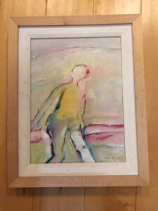
 JS owns an oil on canvas with no signature. The back reads “Carmel Art Association.” She wonders if I consider the painting good enough for her to do considerable research to find the artist. For this she needs to know how to JUDGE a painting. I suggest a formal analysis of the work.
Certain elements in a painting distinguishes an amateur work from an accomplished work. Just like certain grammatical and rhyming elements determine a good poem.
The following seven elements form the structure of a painting:
- Color
- Value
- Texture
- Space
- Form
- Shape
- Line
All works contain at least a few of these elements
Once JS sees the components of the work, she’ll judge if she wants to track down the artist.
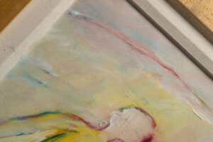
SHAPE: a shape in a painting is a two-dimensional enclosed figure that reads as having a certain length. In JS’ painting we see the human shape, bound by lines. Within that shape we perceive contours. Those contours lead us to the next element, FORM.
 FORM: this tricky element refers to the illusion of three dimensions, in a two-dimensional work. Form suggests three dimensions achieved by the artist’s expertise in contouring within a shape, through the use of shadowing, modeling, or texturing. In JS’s work you see the human body figure has “volume,” in other words it looks like the figure has depth in space. Note the waist and the hips of the figure. We spot expertly accomplished depth. For patrons to ‘read’ properly, a painting will deal with SPACE, the next element.
SPACE: Space creates the illusion of distance in a painting, as well as sometimes the illusion of NOTHING-ness or No Space. Together they add a feeling of location in a work. In JS’ piece the figure stands in a certain scale in relationship to the horizon line rendered in pinks in the background. We may “read” that the figure “stands” before a vista of landscape with rolling hills. The “no space” area is the “sky” with no indication of WHERE about it. However the no-space is expertly rendered to give the viewer a sense the figure stands in some kind of atmosphere. The artist achieved this by using another element, TEXTURE.
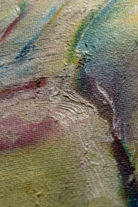
TEXTURE, Like FORM, Implies Three Dimensions
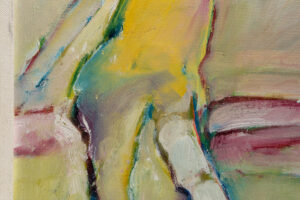
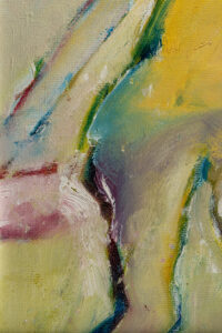 Look at the line of purple on the figure’s right “leg.” The subtle brushstrokes of purple, set off by white, and then blues and greens, indicate the depth of the leg and also add interest. The deep purple of the leg is highlighted by white, which brings me to the next element, VALUE.
VALUE, the hardest element to capture, requires an ability to see the tonal range in any given color, and the technical ability to communicate the right range on paper or canvas. Look again at the purple line of the leg. That purple is the darkest purple VALUE used in this painting, among other purples of lesser value. Some artists are simply better at seeing color variations. For example a blue tone goes from dark blue to light. To master value well indicates years of experience in both SEEING/LOOKING and in TECHNIQUE. Check out the way the values of colors change for intended REASONS in this work.
Now to something important! Hue is NOT value…..
 The common use of the term “value” we associate with monetary worth, but value means something slightly different in the forensic analysis of a work of art. Classical composition classes have used the term VALUIE for generations to mean the CLARITY of color in the application by the artist of that color. HUE is the color, and value is the clarity, depth, tone of that color.
Let me make a musical analogy to define the difference between value and hue in judging a work of art. A violinist plays a C note and the listener hears it as the note C. An accomplished violinist will add to, or subtract from, the note itself to create clarity or depth, perhaps using various techniques. For example using vibrato, dampening the string, amplifying the sound, etc. HUE is analogous to the note, and value analogous to the SKILL with which the note is played. A good artist uses the hue BLUE, but a great artist will HANDLE the blue with a difference. The handling of the hue is VALUE.
The subtlety of value CHANGE indicates skill in the medium, and a talent for SEEING as well, which leads me to the next element, COLOR.
 COLOR traps many viewers because we all have favorites. Beyond personal preference I look for certain handling of color that indicate expertise. A good artist will grasp elements within any color: intensity, strength or weakness of a color; value, appreciation of clarity or brightness; hue, actual color itself. A gifted “eye” means an artist will both see color and handle pigment with a special insight. And finally, the most obvious element, and saved for last, LINE.
LINE is ONE element that does NOT exist in nature, but it is a necessity in art. Without line, there is no art, it is said.
DO I think JS’ painting is worthy? YES, I do.
Thank you.
Having read your article I feel I have revised the whole of my art education in one session.
The bit about the importance of “ LINE” is instructive.
I recently thumbed through a book written by
Gemma Guasch & Josep Asuncion in the Creative Painting series.
This I found quite complex !
But then I am a Physician with an interest in Art.